Corporate website design for a co-working center
Inspiring creative collaboration with our exceptional space designs
year
2021
service
UX Research, UX/UI
client
Raumzeit
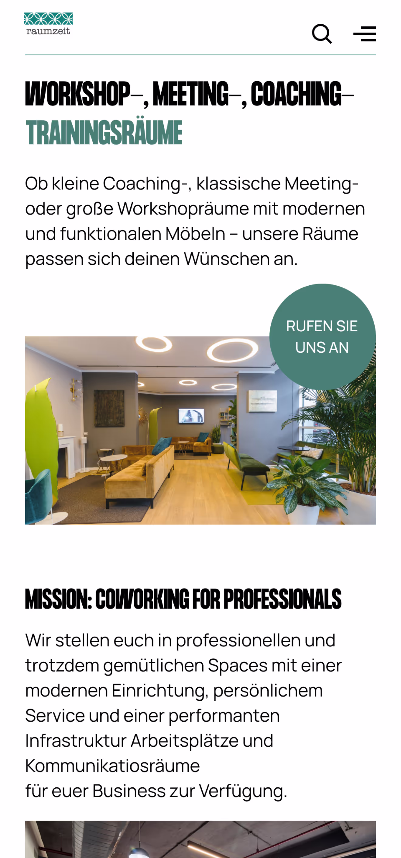
Raumzeit coworking spaces offer more than just temporary space: with our state-of-the-art workstations, team offices, conference and seminar rooms, you have the opportunity to work as flexibly as possible.
The main purpose of developing the design concept was to allow the user to immediately find the information he needs. In addition, it was decided to keep the colors used on the current website because users do not like drastic changes and get used to using the existing functionality.
The typography was completely redesigned. It was decided to change it because the current typography does not draw attention to itself, especially the headings. Coworking is a space rental service for business people, so it is very important that the headlines attract attention.
The typography was completely redesigned. It was decided to change it because the current typography does not draw attention to itself, especially the headings. Coworking is a space rental service for business people, so it is very important that the headlines attract attention.
• case study
Various aspects of the user experience were also considered during the project. I conducted several rounds of testing, gathered feedback, and made the necessary adjustments.
Every element of the interface was analyzed for its impact on the overall site experience. Our goal was to ensure that every user who accessed the site felt comfortable, easy to use, and impressed with the visual aesthetics and functionality. Ultimately, the design became not just a means to find information, but a tool to enhance brand perception and value in the eyes of the user.
As a result, the work to redesign the site included not only changes to the visual design, but also significant improvements in the area of user interaction. My goal was to create a space where every element worked to the benefit of the user, providing convenience, accessibility, and aesthetic pleasure. In doing so, we not only met current needs, but also laid the groundwork for future innovations and improvements.
As a result, the work to redesign the site included not only changes to the visual design, but also significant improvements in the area of user interaction. My goal was to create a space where every element worked to the benefit of the user, providing convenience, accessibility, and aesthetic pleasure. In doing so, we not only met current needs, but also laid the groundwork for future innovations and improvements.
01
Research and analysis
Before developing the website design, I conducted a competitive analysis. A number of competitors were selected for consideration, including various corporate sites, including co-working sites.
02
Wireframing and prototyping
During the prototyping phase, I created a block structure to visualize how the design interface would look and where the different elements would be located. I started with simple diagrams to define the main areas and components such as buttons, menus, and input fields. I then moved to a more detailed prototype, adding all the text, fonts, and basic interactions to the pages. This process allowed me to see how users would interact with the site. I was able to make any necessary adjustments before the development phase began.
03
UI Design
I used a variety of colors and carefully selected images to give the design a complete and harmonious look. This not only provided aesthetic appeal, but also helped to create a pleasant and intuitive user interaction, which improved the perception and usability of the site.
Designing a website for a coworking space is a complex process that requires a deep understanding of how users interact with the site and what they expect to see.
First, understand user needs. I studied what exactly users need, how they use the site, and highlighted important features. The main task was to design the interface so that users could quickly find the information they needed.
Second, navigation and structure. I created a simple and clear navigation so that users can easily navigate the site and quickly find what they need.
The third aspect is the visual identity. I decided to keep the current color palette for the comfort and recognizability of the site.
Second, navigation and structure. I created a simple and clear navigation so that users can easily navigate the site and quickly find what they need.
The third aspect is the visual identity. I decided to keep the current color palette for the comfort and recognizability of the site.
• conclusion
As a result, work on the site has far exceeded expectations, not only meeting current user needs, but also providing a solid foundation for future improvements and enhancements. I paid attention to every aspect to create a platform that would adapt to changing user needs and technological innovations.
[1]
The process
It was a complex and multifaceted process that included everything from creating a unique visual design that reflects the brand's personality to developing an intuitive and user-friendly interface that enhances the user experience.
[2]
USER RESEARCH
I conducted a lot of testing and received valuable feedback to ensure that every element of the site worked for the benefit of the user, making their stay on the platform as comfortable and productive as possible. As a result, the project was not just updating the website, but transforming it into a powerful tool for achieving business goals and strengthening market positions.