Design of the e-commerce website
Aesthetics and functionality: the perfect design for LAVAZZA
year
2024
service
UX Research, UX/UI
client
Lavazza
The story started in 1895, when Luigi Lavazza opened the first Lavazza store in via San Tommaso in Turin. He was a man with great initiative, inventiveness, and passion for his work.
The Lavazza coffee we drink today is the result of a combination, created by Luigi, of coffee beans from different parts of the world. While maintaining the same values of the little coffee shop that opened over a century ago in the historic heart of Turin, the Lavazza Group currently has over 4,000 collaborators across the world, 9 manufacturing plants in 6 countries and exports to over 140 countries.
• case study
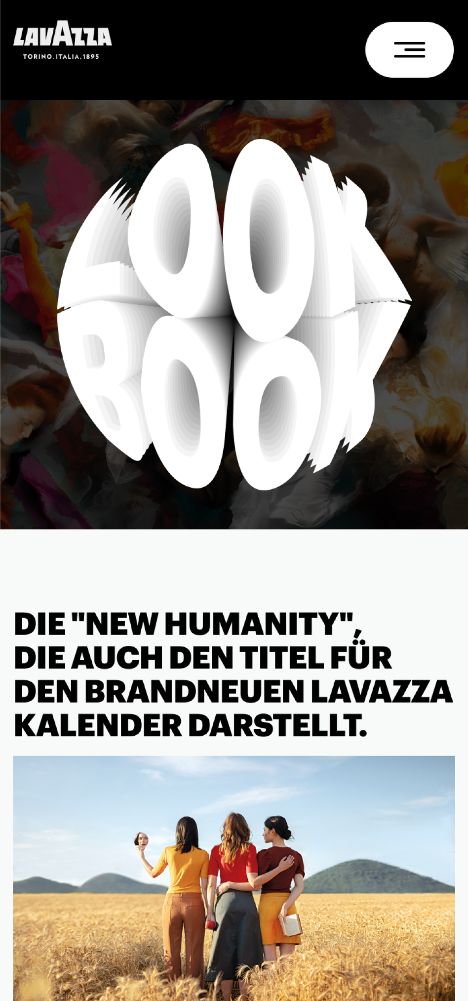
I've had the incredible opportunity to work on a project that will completely redesign the online shop of the Lavazza company. The main objective was to give their site a modern and attractive look, and I'm thrilled to have been part of this exciting venture.
The most important thing for me was to make the design not only attractive, but also easy to use, ensuring that it would be visually appealing to users while being highly functional. I wanted to ensure a seamless interaction that would allow users to navigate effortlessly and enhance their overall experience.
I also wanted to provide a pleasant user experience that would leave a lasting impression. It was also a huge priority for me to respect the values of the Lavazza brand. I was thrilled to ensure that every design element reflected the brand's rich heritage and commitment to quality.
I also wanted to provide a pleasant user experience that would leave a lasting impression. It was also a huge priority for me to respect the values of the Lavazza brand. I was thrilled to ensure that every design element reflected the brand's rich heritage and commitment to quality.
01
Research and analysis
Before developing the website design, I conducted a competitive analysis. It was selected analyzed a lot of competitors, including online stores selling coffee and coffee machines.
02
Wireframing and prototyping
During the prototyping phase, I created a block structure to visualize how the design interface would look and where the different elements would be located. I started with simple diagrams to define the main areas and components such as buttons, menus, and input fields. I then moved to a more detailed prototype, adding all the text, fonts, and basic interactions to the pages. This process allowed me to see how users would interact with the site. I was able to make any necessary adjustments before the development phase began.
03
UI Design
During the UI design phase of the website for the online store, I tried to use graphic elements to make the interface more visually appealing. I used a variety of colors and carefully selected images to give the design a complete and harmonious look. This not only provided aesthetic appeal, but also helped to create a pleasant and intuitive user interaction, which improved the perception and usability of the site.

• conclusion
When designing this project, I spent a lot of time using Photoshop to create various graphic elements. I also paid attention to details such as shadows, gradients, and lighting effects to make the design more professional and attractive.
[1]
The process
The process of creating the graphic elements involved several steps. First, I did some research to understand current design trends and determine which elements would work best for the project. I then began to create rough sketches that helped me visualize the initial ideas and concepts.
[2]
Graphic Design
I then worked out the details of each element. I used various Photoshop tools to create and edit the images, adding unique effects and styles. It was important not only to create beautiful graphic elements, but also to make them functional and consistent with the overall style of the project.