Online banking application
Your financial freedom, our mission - Bank without boundaries
year
2023
service
UX Research, Accessibility, UX/UI
client
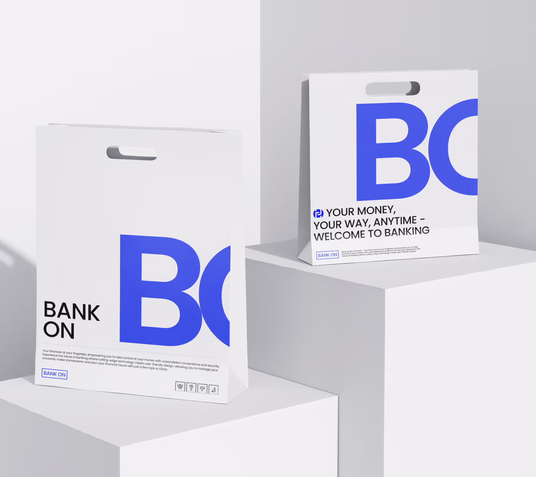
Bank On
This is a conceptual assignment I created as part of the UI part of the UX Design Institute course. I took this course at the UX Design Institute to expand my knowledge of user interface design.
During my training, I did exercises to practice the theory I was studying. I created mood boards, generated icons, selected a color palette, and developed a prototype and UI design. As a result, there were 9 screens (designs) for the banking application. The duration of the project was December 2022 - April 2023 (part-time).
• case study
The goal of the project was to design a user interface for a new banking application. Our client wanted to bring excitement to the financial industry with an intuitive web application for personal banking. The design needed to work seamlessly across desktop computers, tablets and mobile devices.
The goal of the project was to develop a user interface for a new banking application with a special focus on accessibility for all categories of users, including those with various visual impairments. This required a thorough analysis of the needs of different user groups and the application of modern adaptive design technologies.
In the process, I created a universal design that works across desktop, tablet, and mobile devices. As a result, regardless of their physical abilities or preferred devices, banking services have become truly convenient and accessible for all categories of users. This not only increases customer satisfaction, but also helps to reach a wider audience, which is important in today's competitive banking environment.
In the process, I created a universal design that works across desktop, tablet, and mobile devices. As a result, regardless of their physical abilities or preferred devices, banking services have become truly convenient and accessible for all categories of users. This not only increases customer satisfaction, but also helps to reach a wider audience, which is important in today's competitive banking environment.
01
Mood board
I conducted a comprehensive competitor analysis to ascertain the project's prospective trajectory. This entailed examining their respective strengths, weaknesses, unique value propositions, and market strategies. Having completed this phase, I proceeded to create a mood board, which served as a visual manifestation of my ideas and concepts. This allowed me to devise a cohesive and appealing interface, fully aligned with the project's original vision.
02
Fonts
The quality of typography is the foundation of any successful user interface design. In light of these considerations, I undertook a meticulous process of font selection and developed a typographic scale for the banking app. The primary objective was to fulfill the brand requirements, which included elements of playfulness, clarity, and trustworthiness (Playful, Clear, and Trustworthy).
03
Colour palette
The color palette is a crucial element in communicating a brand's personality through the user interface. I drew inspiration from the products and brands of other banking apps in order to gain insight into how these could be applied to our own offering. As a result, I was able to create a color palette for the app that accurately reflects the brand values.
04
Icons
The icons were developed to reflect the brand's three founding principles: playfulness, clarity, and reliability. Each icon was designed to fulfill its own role and to represent these values. Playfulness is shown through light, dynamic lines and shapes. Clarity is ensured through simplicity and intuitive understanding. Reliability is conveyed through balanced compositions.
05
Responsive design
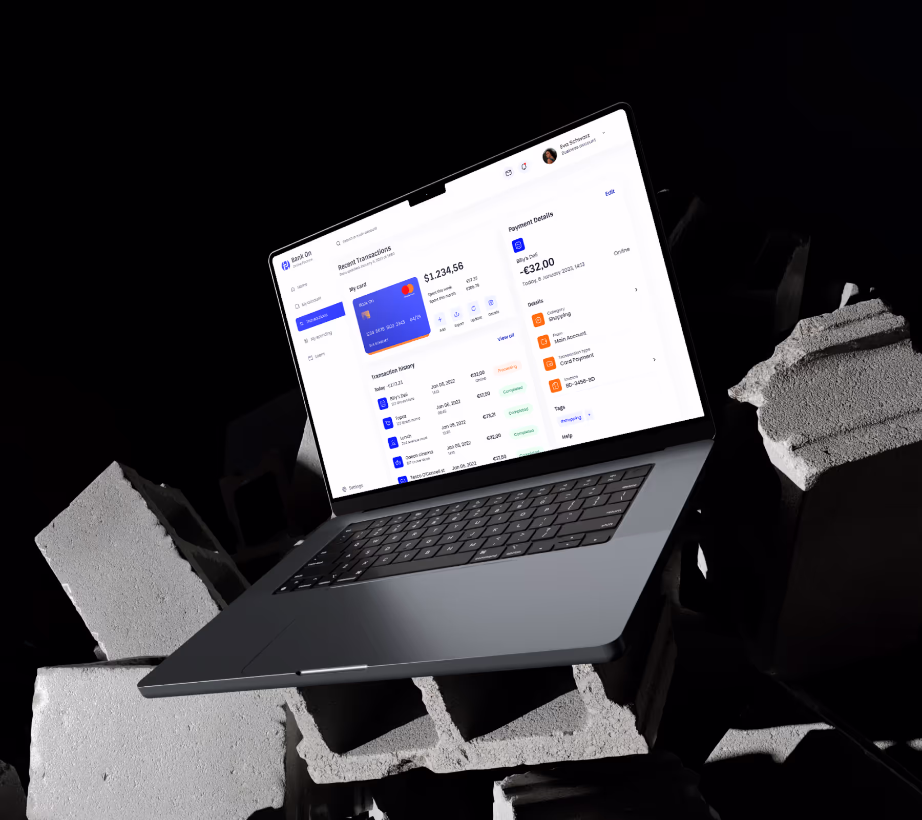
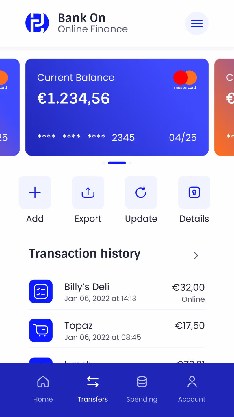
I developed three types of adaptive interfaces for desktops, tablets, and cell phones. Three screens were created for each device. This brought the total number of screens to nine, ensuring a complete and consistent user experience.
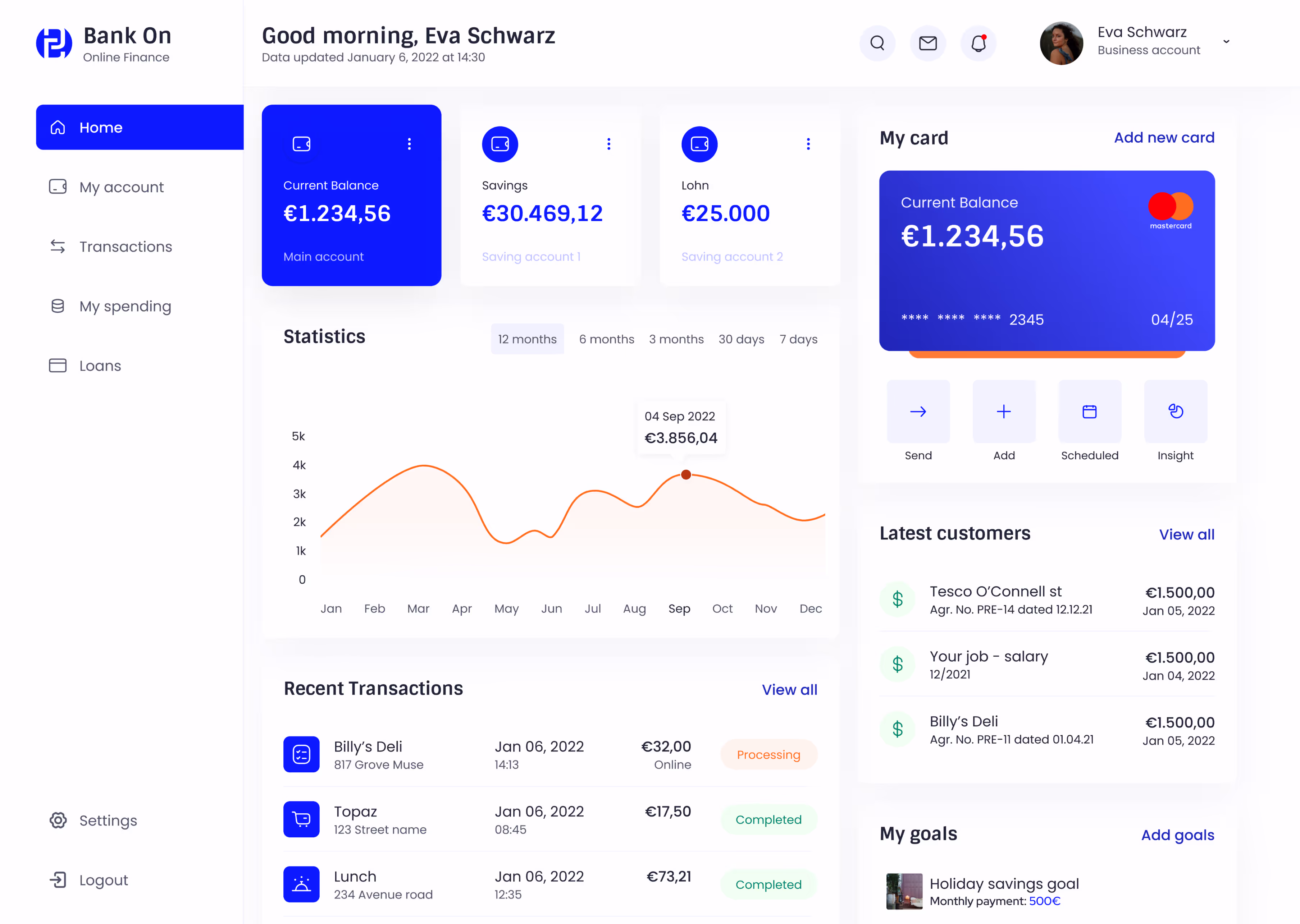
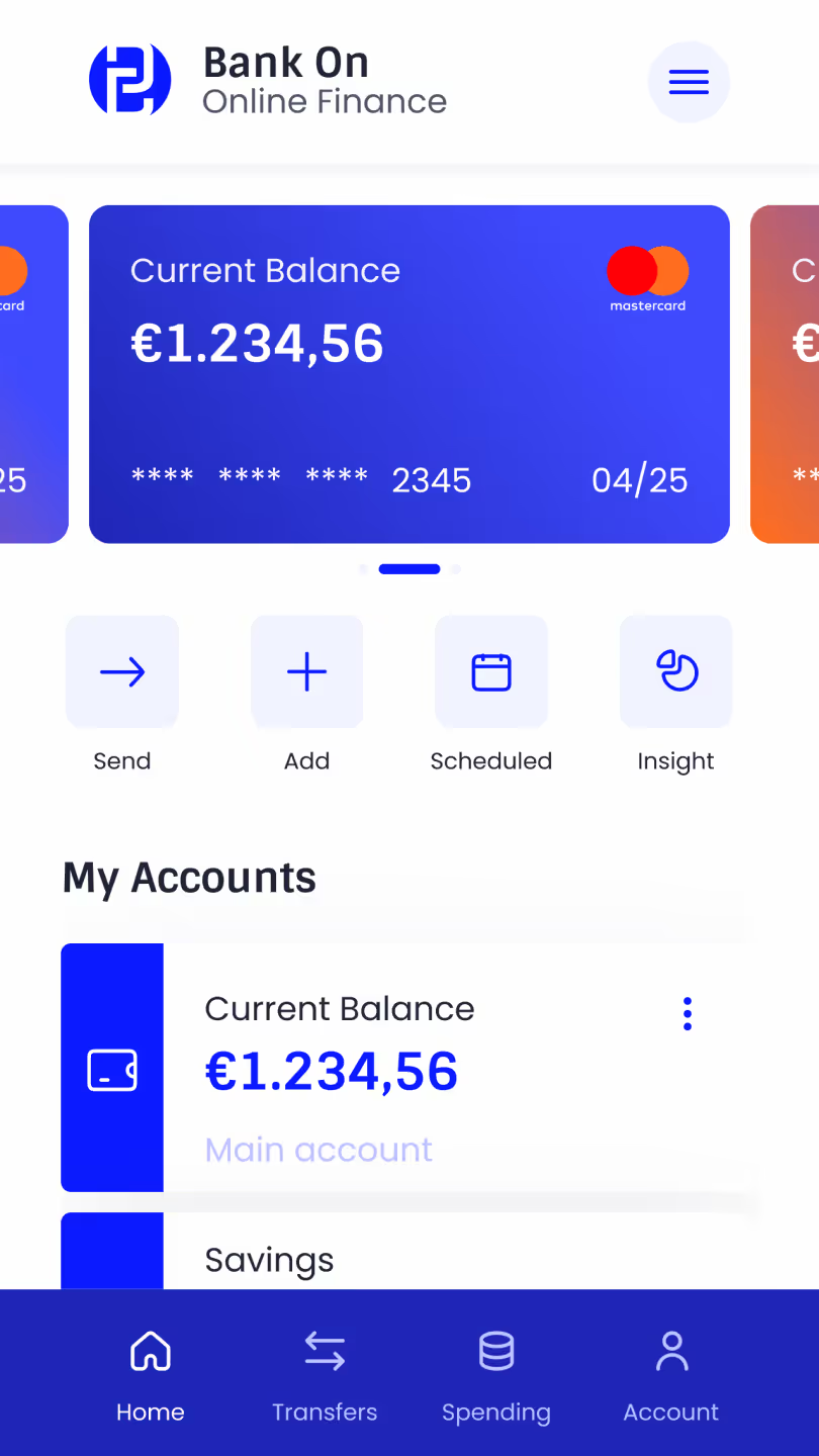
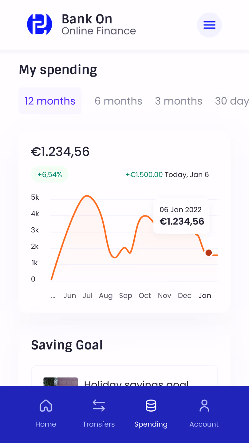
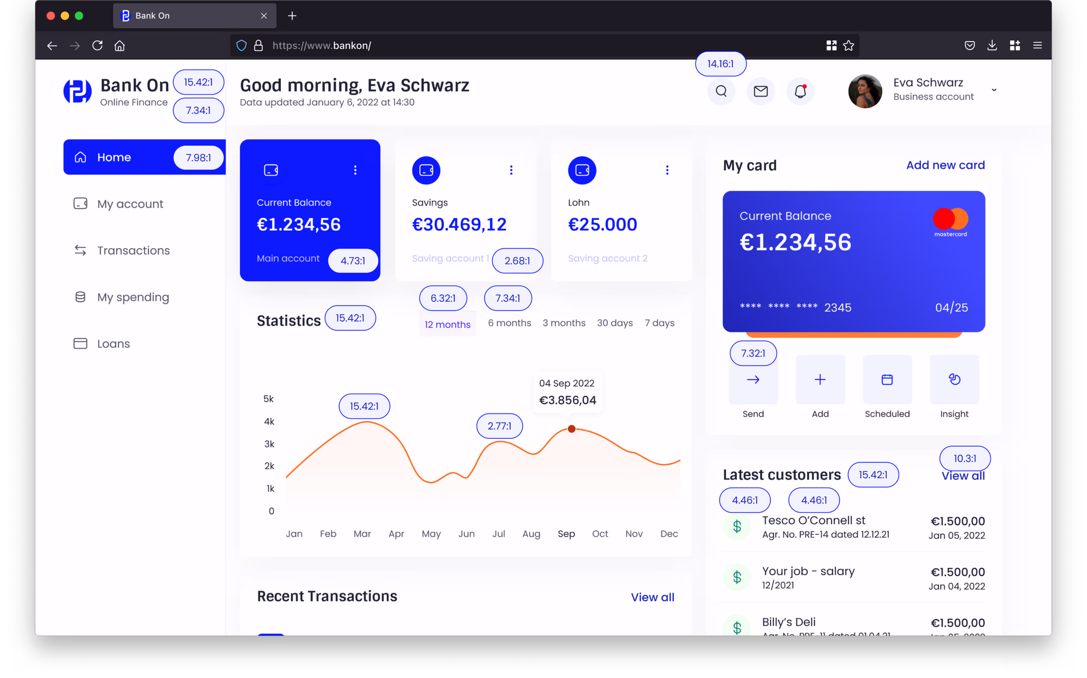
The transactions page is one of the most popular pages in a bank app. The first thing to display on banking apps is the client's physical card. I wanted to create a real app, so I ignored Dribble and Behance.
Mobbin.com had lots of screenshots of real banking apps that helped me with this project. I added icons to each transaction so users can distinguish them. It separates the transactions visually. To use all the space, I showed you how the work screen will look if the user wants to learn more about the operation.
• Accessibility
To guarantee accessibility for the widest possible range of users, including those with health issues, I have verified that the color contrast of all content meets API standards. I primarily worked in Figma and discovered a plugin called "Stark" that facilitates color contrast verification.
I devoted significant attention to accessibility, as the banking application's target audience includes individuals with visual impairments, color blindness, and reading difficulties. Consequently, it is crucial to prioritize contrast considerations during the design process.
• conclusion
I had gathered a comprehensive set of mood board materials, which proved invaluable in the design of the screens. My primary objective was to develop an intuitive interface that any user could navigate with minimal effort. While considerable time was invested in the mood boards, particular attention was paid to concepts derived from real-world banking applications.
[1]
The process
In selecting the color palette, I opted for blue shades, as this color is perceived as trustworthy by users, which is a crucial attribute for a banking application.
The 8-point grid system was the optimal choice, as it is a system I frequently utilize when designing interfaces. As a meticulous designer, I found the precision with which objects could be placed across grid elements, frames, and components highly valuable.
The 8-point grid system was the optimal choice, as it is a system I frequently utilize when designing interfaces. As a meticulous designer, I found the precision with which objects could be placed across grid elements, frames, and components highly valuable.
[2]
about playful
It was crucial to align the brand's principles with the design. The goal was to create a playful, understandable, and trustworthy experience. If there had been no prior agreement, I would not have employed a playful approach in the bank application, as I believe this principle is not well suited to the banking sector. It is more appropriate for use in games.
I believe that a modern, concise design would be more effective in inspiring confidence among users, as reliability is the primary function of a banking app.
I believe that a modern, concise design would be more effective in inspiring confidence among users, as reliability is the primary function of a banking app.